H
O
M
HEAD OF MARBLE
ROLE:
OWNER & DESIGNER
TIMELINE:
2018-PRESENT
KEY RESPONSIBILITIES
- BRAND EXPRESSION
- SITE DESIGN + DATA DRIVEN OPTIMIZATION
- 3D & AR ASSETS
- PHOTO & VIDEO
- PRODUCT DESIGN
PRESS:
- FAST COMPANY
- DESIGN MILK
- POPULAR MECHANICS
- GREEN BUILDING & DESIGN
PROJECT TYPE:
DTC E-COMM
PROJECT BRIEF:
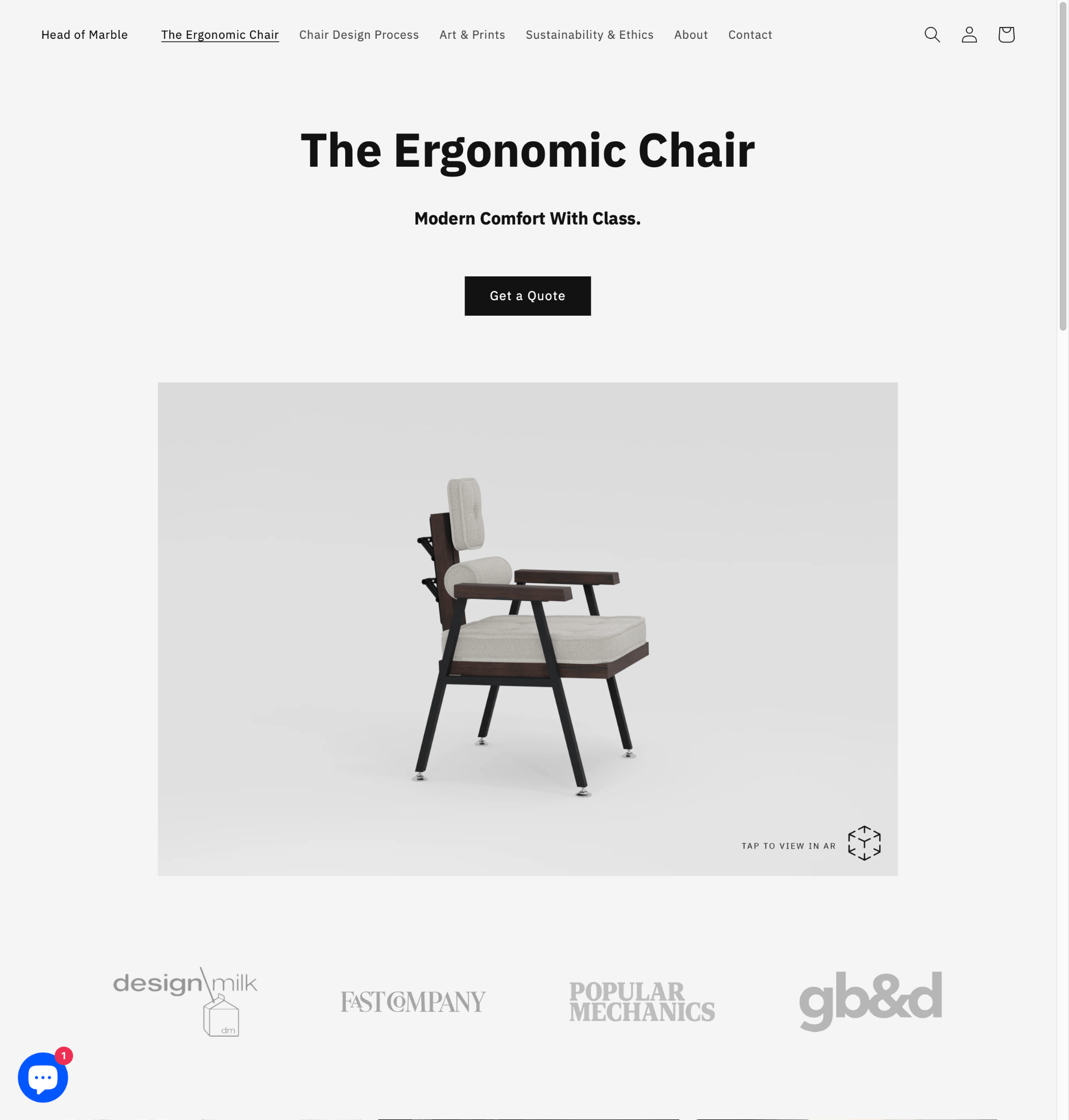
In 2018, I pursued my passion for industrial design by launching a direct-to-consumer furniture company. Drawing on my experience building hundreds of e-commerce sites at First Dynamic Websites, I developed a streamlined, single-page shopping experience powered by Shopify and enhanced with cutting-edge AR product visualization.
Visit the site

OUR FIRST BIG MOMENT
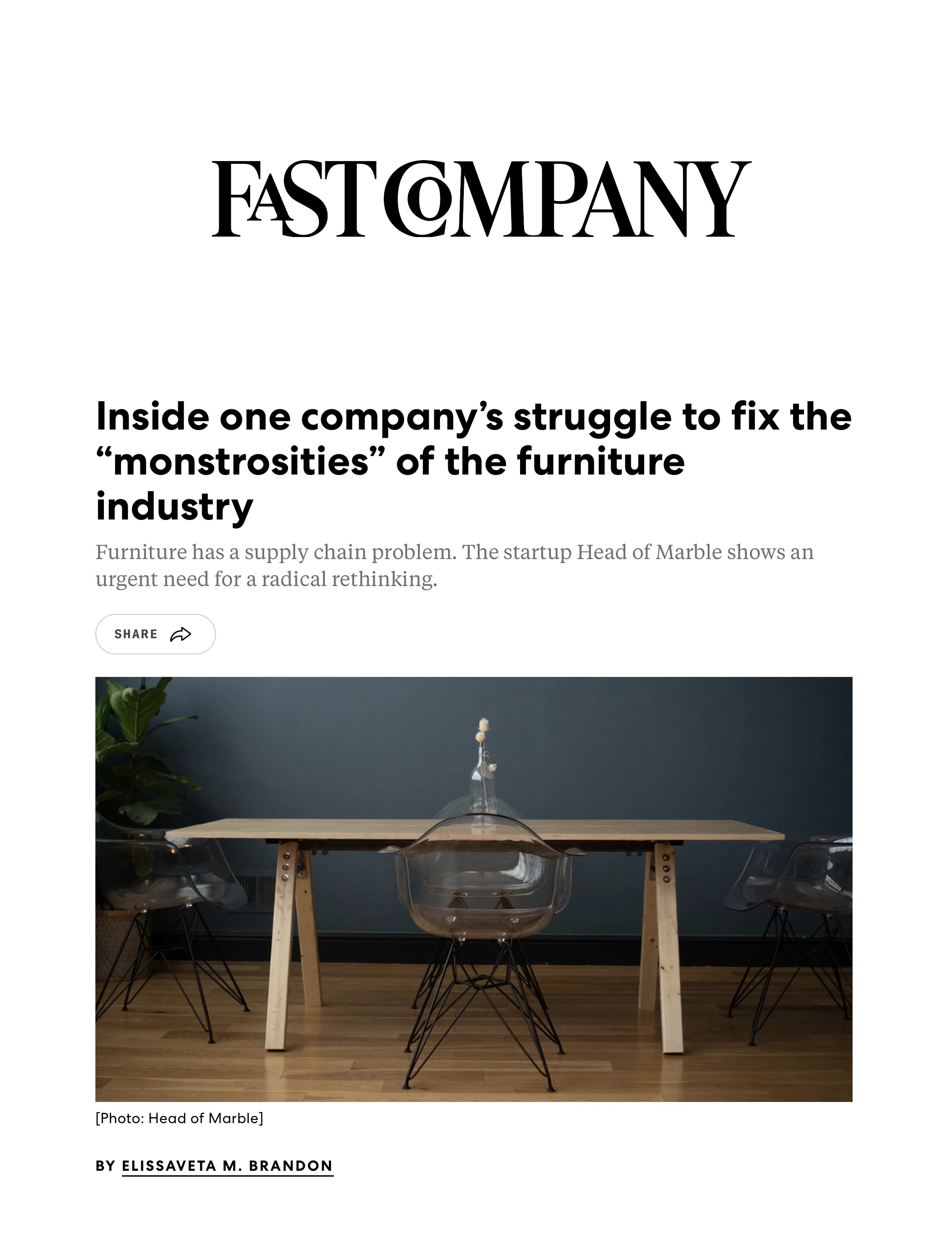
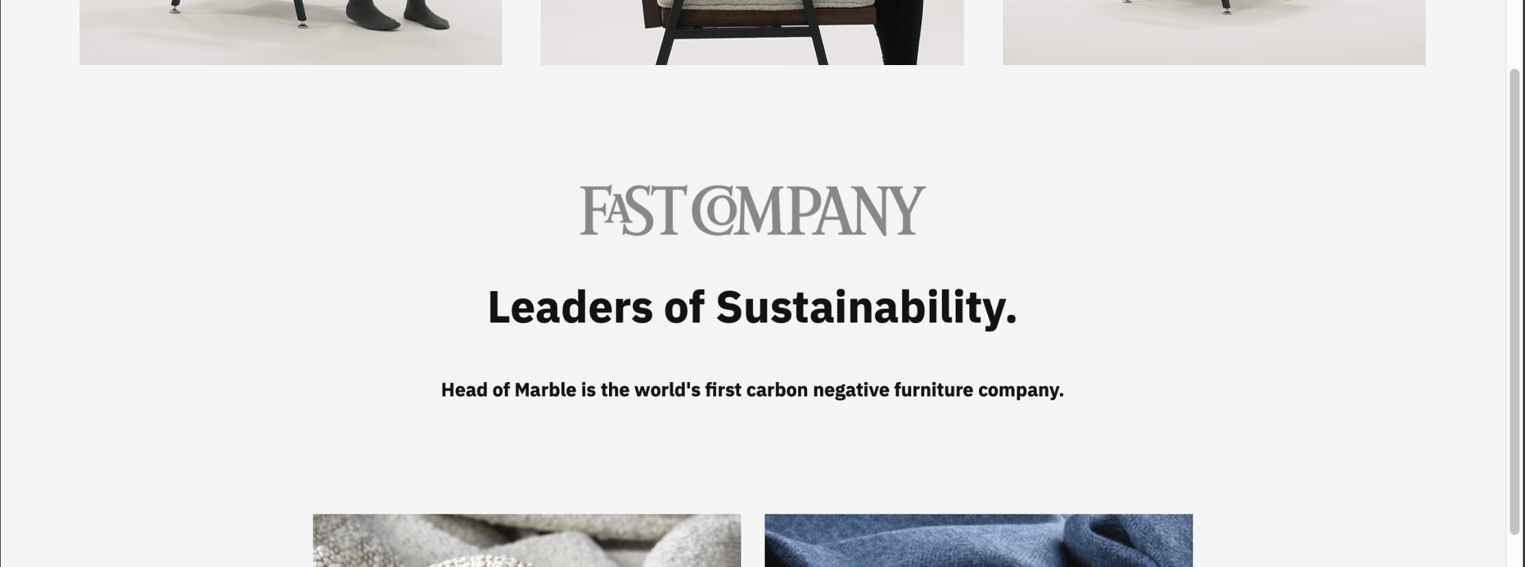
HoM started with a line of tables. My PR team secured organic press, landing a feature in Fast Company, where I spoke on unsustainable practices within the furniture industry. We positioned ourselves as the world’s first carbon negative furniture company and a green leader in the furniture space.
EARLY INSIGHTS
After our carbon-negative profile, I added pages explaining our sustainability practices, but users ignored them. Data showed they preferred concise, press-backed headlines, so I refocused the site around that.
We expanded, but also simplified.
Surprisingly, our press drew in high‑end interior designers rather than mass‑market shoppers. After careful consideration with my PR team, we pivoted from mid‑tier tables to the luxury market.
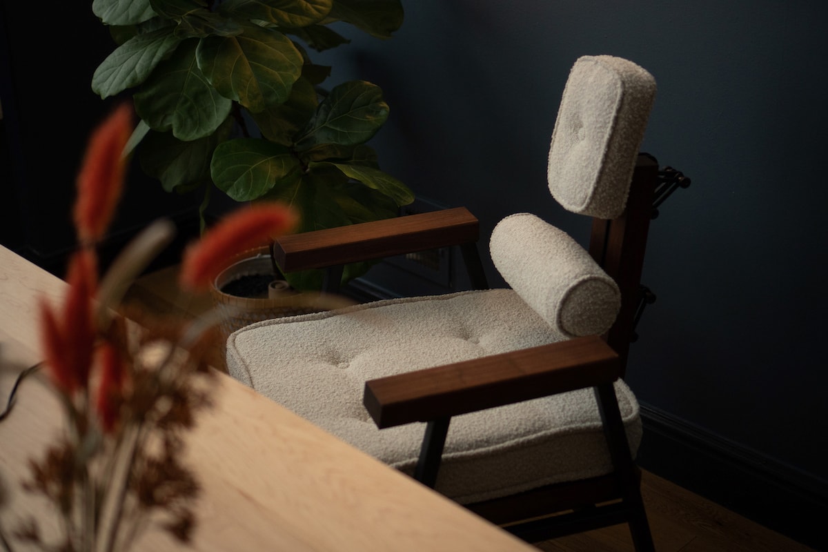
THE ERGONOMIC CHAIR
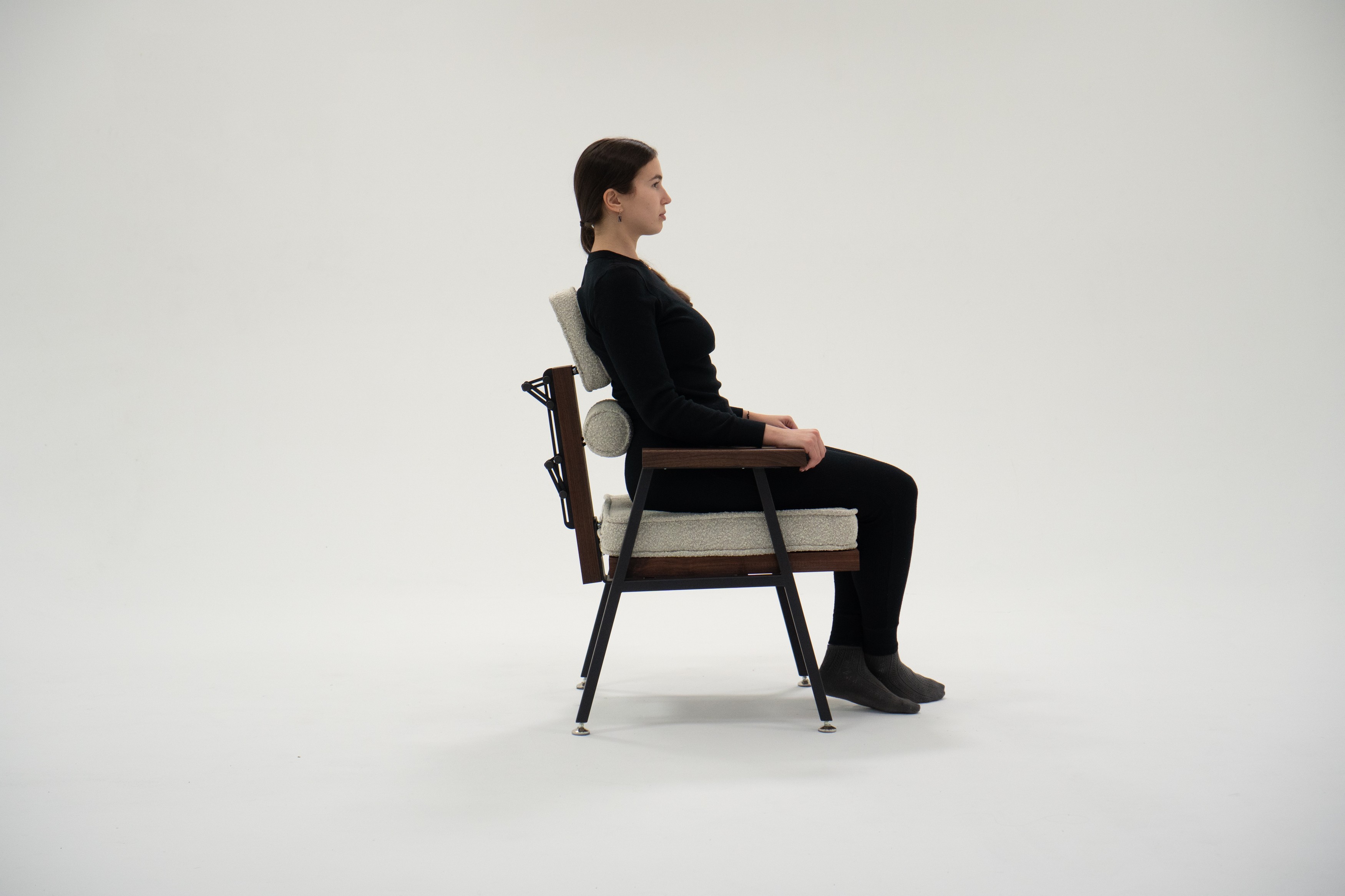
The ergonomic chair eschewed traditional alien looking plastic molded office chairs, reimagining what comfort could look like with a natural material palette.
EARLY ADOPTION OF AR
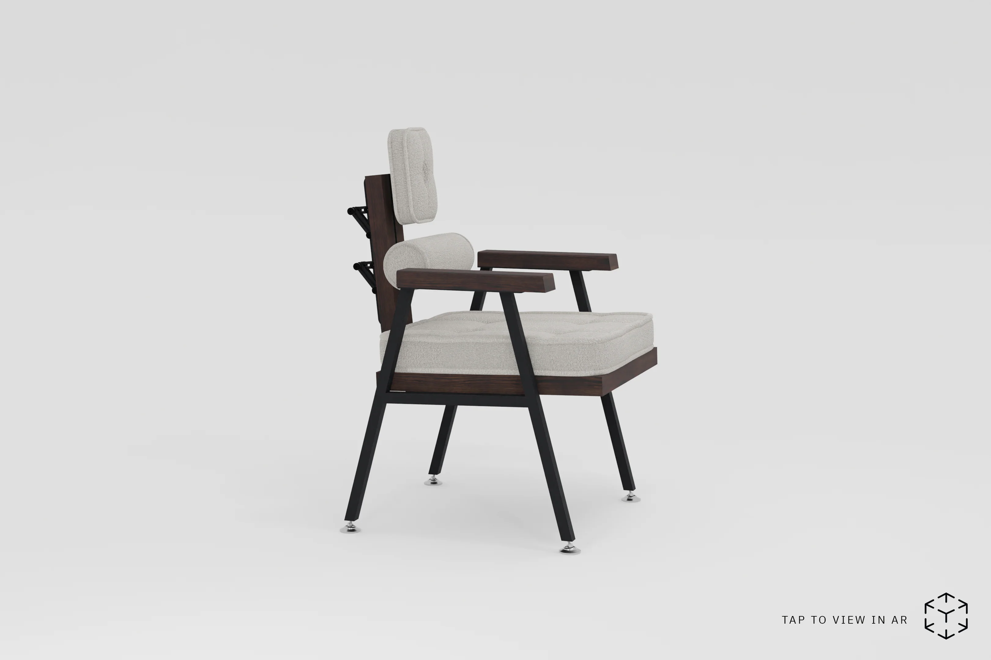
AUGMENTED REALITY
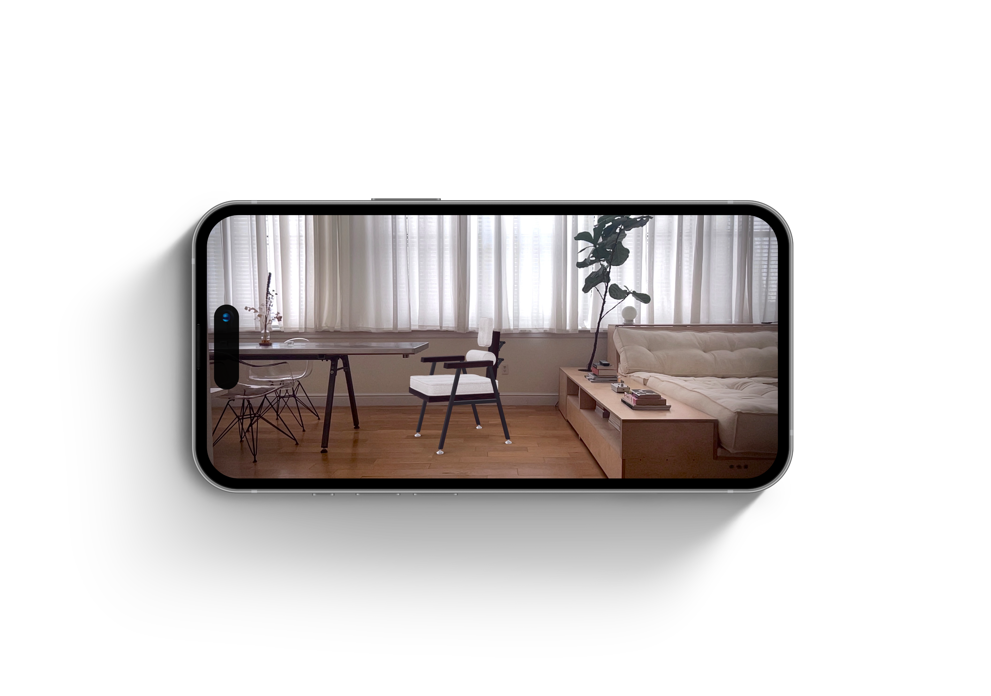
HoM was one of the first, if not the first furniture company to leverage AR for product visualization. At the time, ready made solutions didn’t exist and we had to employ a custom coded one.
try it! Click on the image below.
P.S. AR works on iPhone only.
LESSONS IN DESIGN
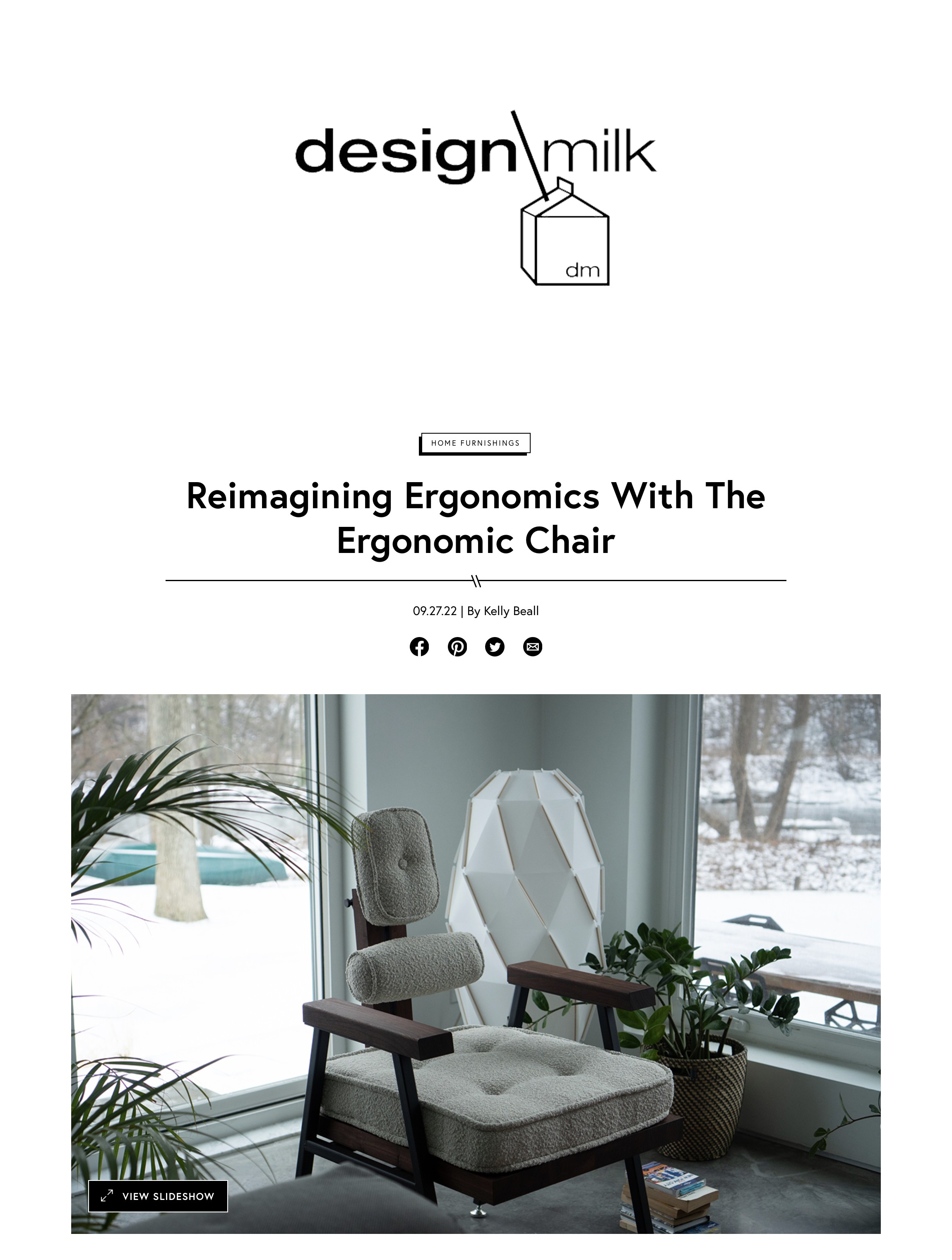
As a designer, you’re always balancing dual imperatives: serving the end user and creating something worthy of attention. Without both, there’s no brand. Fortunately, users found my chair to be incredibly comfy and several press outlets found it worthy of a feature.
FOCUSING ON THE SINGLE PAGE PRODUCT SITE
In Oct 2020, I redesigned our site around a single core product — the chair. Heat maps and traffic analysis revealed that visitors ignored dense content and excessive imagery; simplicity outperformed everything.
We ultimately arrived at a focused, one-page experience where the essentials — press, AR, curated images, and video — carried the message with clarity and impact.
IT WORKED.

CONVERSION RATES!
I continuously refined the product page, testing and simplifying until every element pulled its weight. Over eight months, that work drove a 320% increase in conversion and a 1,700% lift in sales.
CONCLUSIONS
Although the site was built on a Shopify theme, we extended it far beyond its baseline—integrating AR, dynamic media, and press-forward layouts that pushed the limits of DTC product visualization. Iterative testing shaped both our interface and business strategy, leading to significant gains in conversion and sales.
CRITIQUES
The site’s original visual identity was tailored to a mass-market audience — minimal, approachable, and utilitarian. As we pivoted into the luxury tier, that aesthetic lagged behind; the brand would have benefitted from a more elevated design system: refined serif typography, richer contrast, and a moodier, more opinionated palette to signal exclusivity and craft.
REFLECTION
This project demanded fluency across disciplines — physical product design, brand, UX, and systems thinking. It taught me that while data can reshape instinct, it’s often instinct that uncovers what data hasn’t yet revealed.