W
O
N
D
R
SUBJECTIVE MAPPING
ROLE:
FULL STACK DESIGNER
TIMELINE:
2022, 2 WEEKS
PLATFORM:
iOS
PROJECT TYPE:
SPEC MVP
PRODUCT BRIEF:
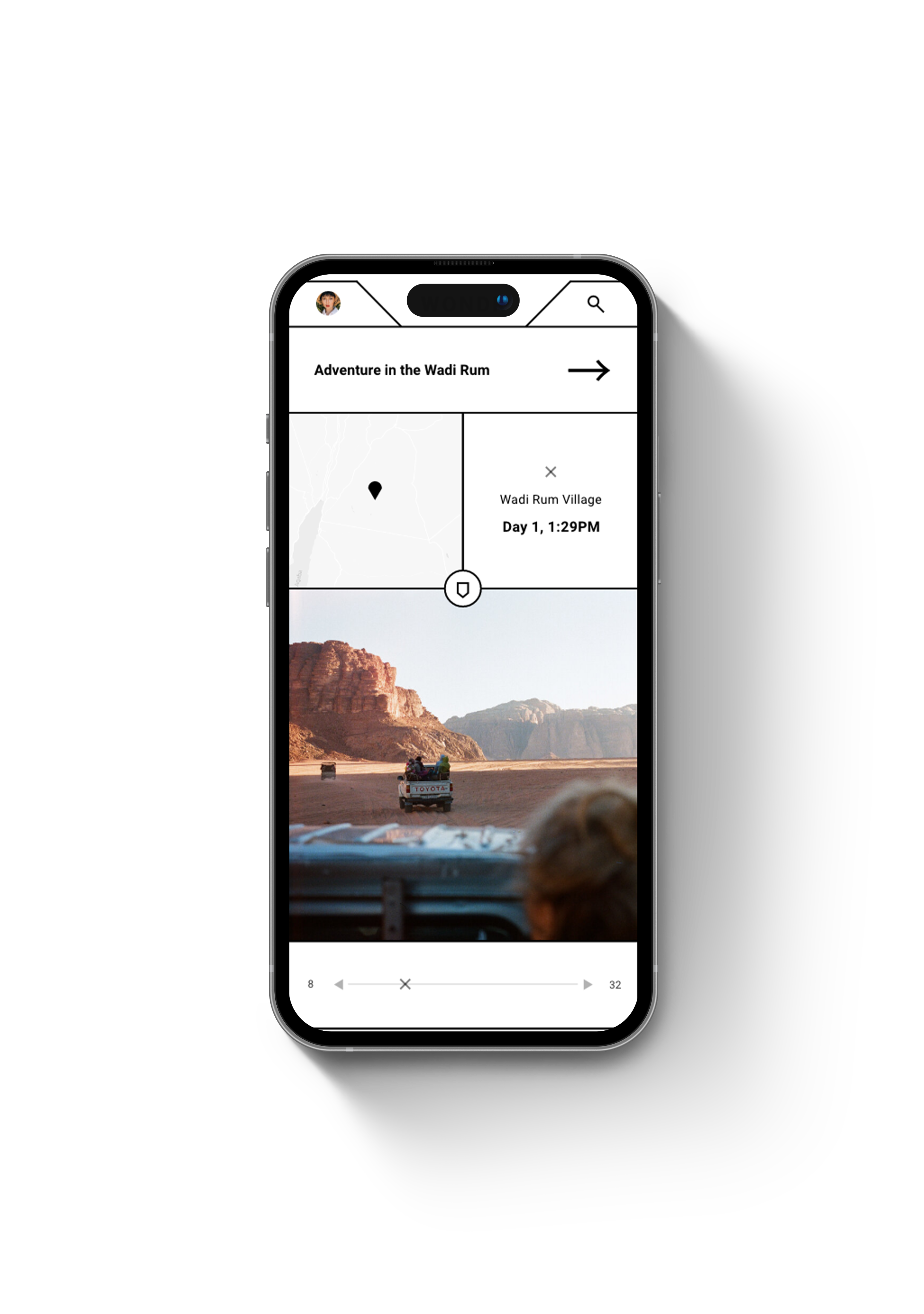
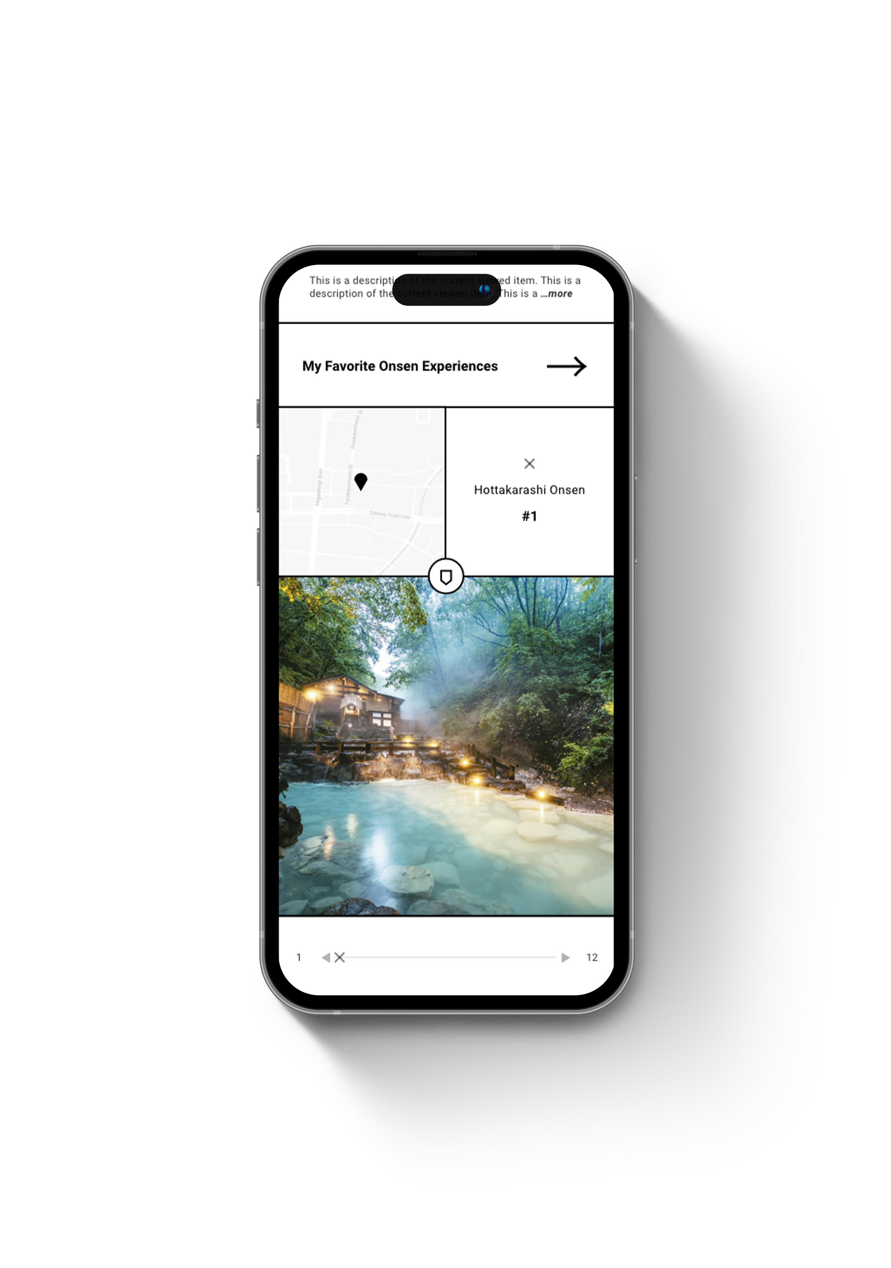
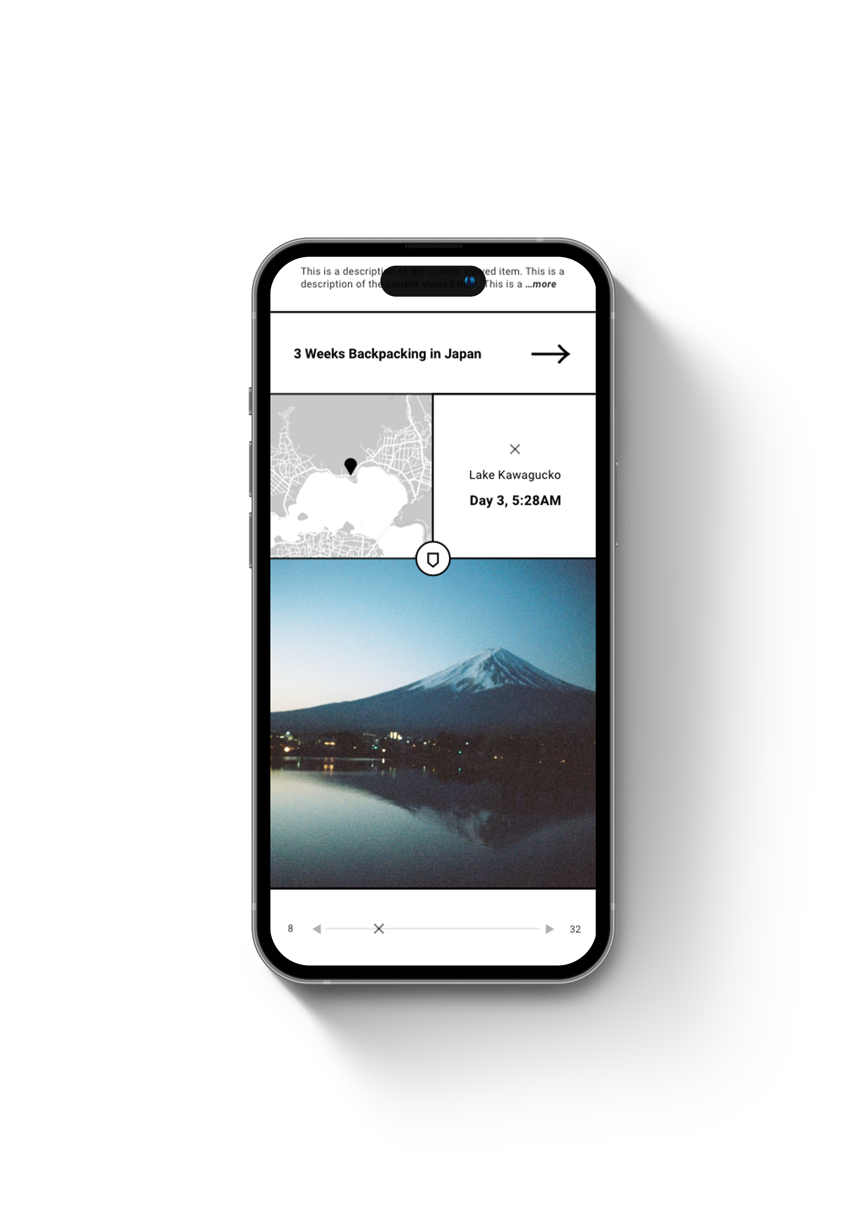
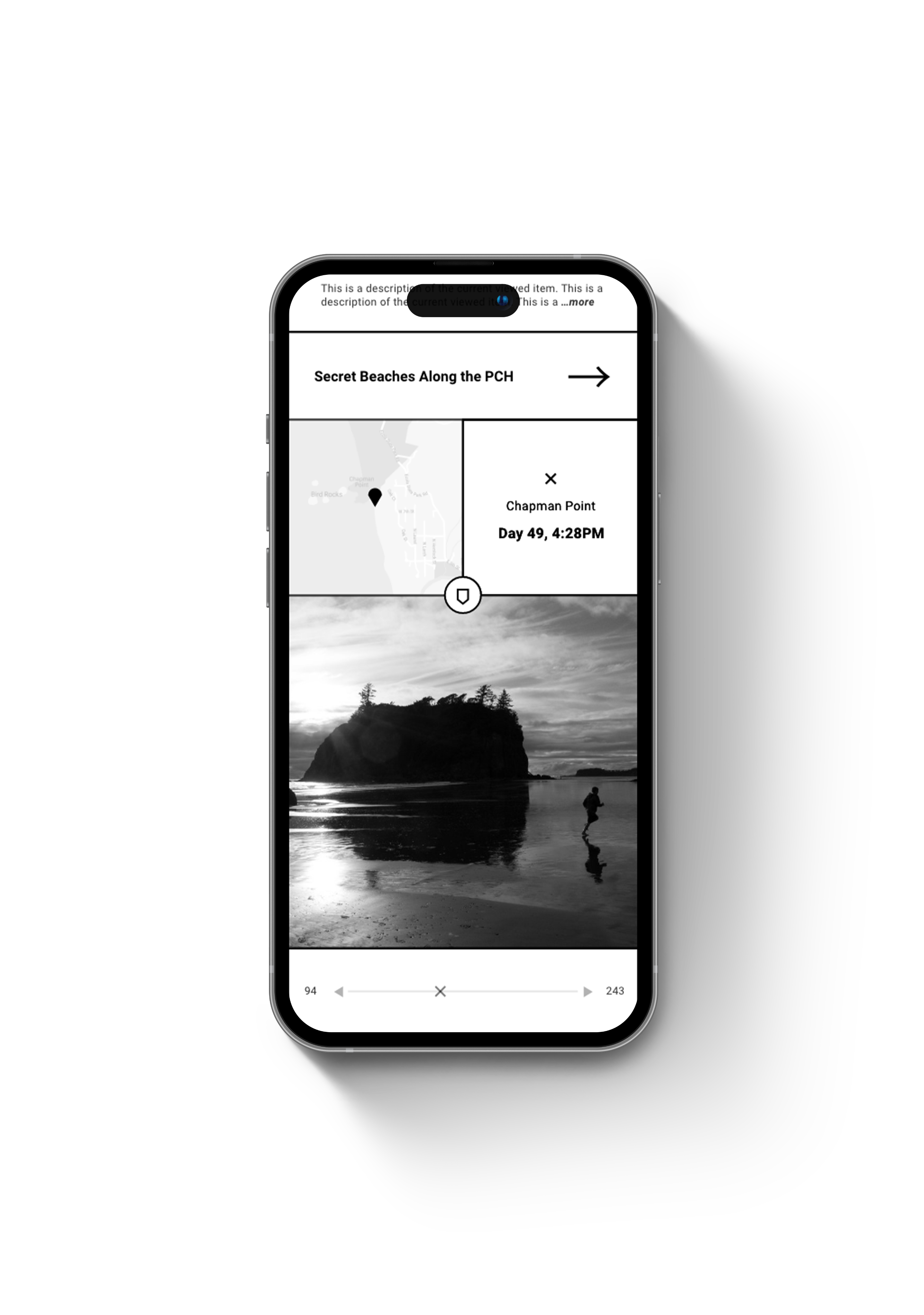
Wondr lets users curate and share personalized map pins — murals in Madrid, cheap bites in New York, cafés made for deep focus. While traditional maps reflect institutional consensus, Wondr remaps the world through a subjective lens.
d
e
s
i
g
n
p
r
o
c
e
s
s
WHERE IT STARTED:
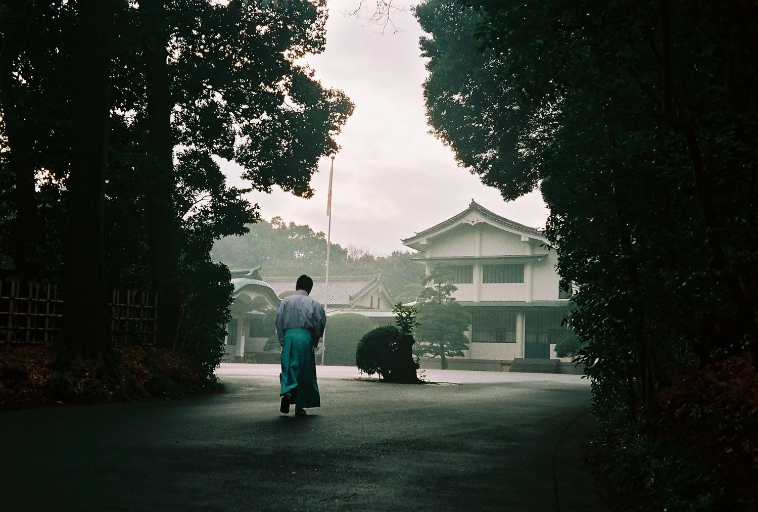
Wondr was born from a lifelong love for travel and photography. Over the years, I began thinking of unconventional ways to communicate and share my travel experiences. It all started with an album.
GEO-SPATIAL MUSIC:
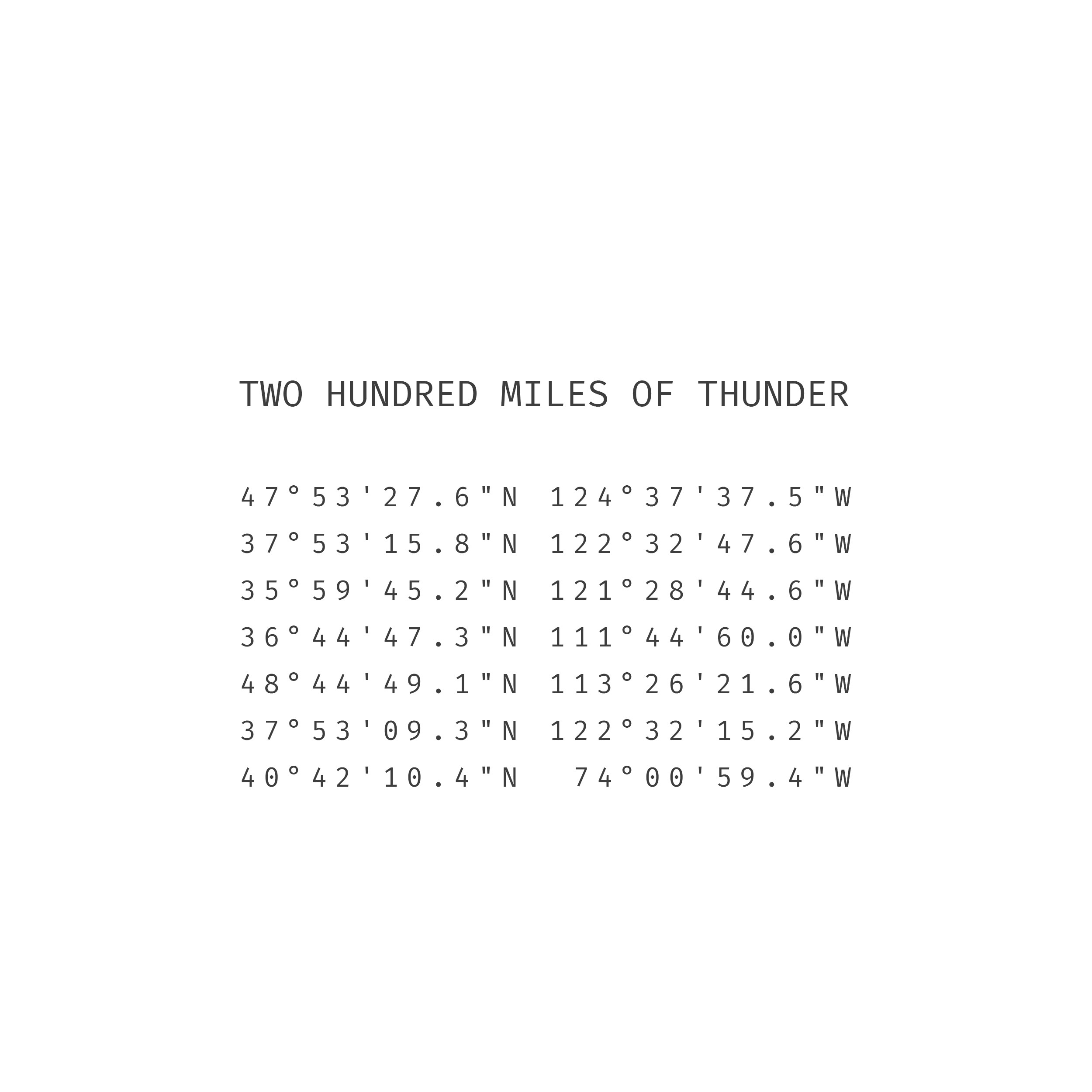
During COVID, I recorded an album where each track was based on GPS coordinates from a three-month cross-country road trip. The music became a sonic map of movement, memory, and place.
CHECK IT OUT
ON SPOTIFY

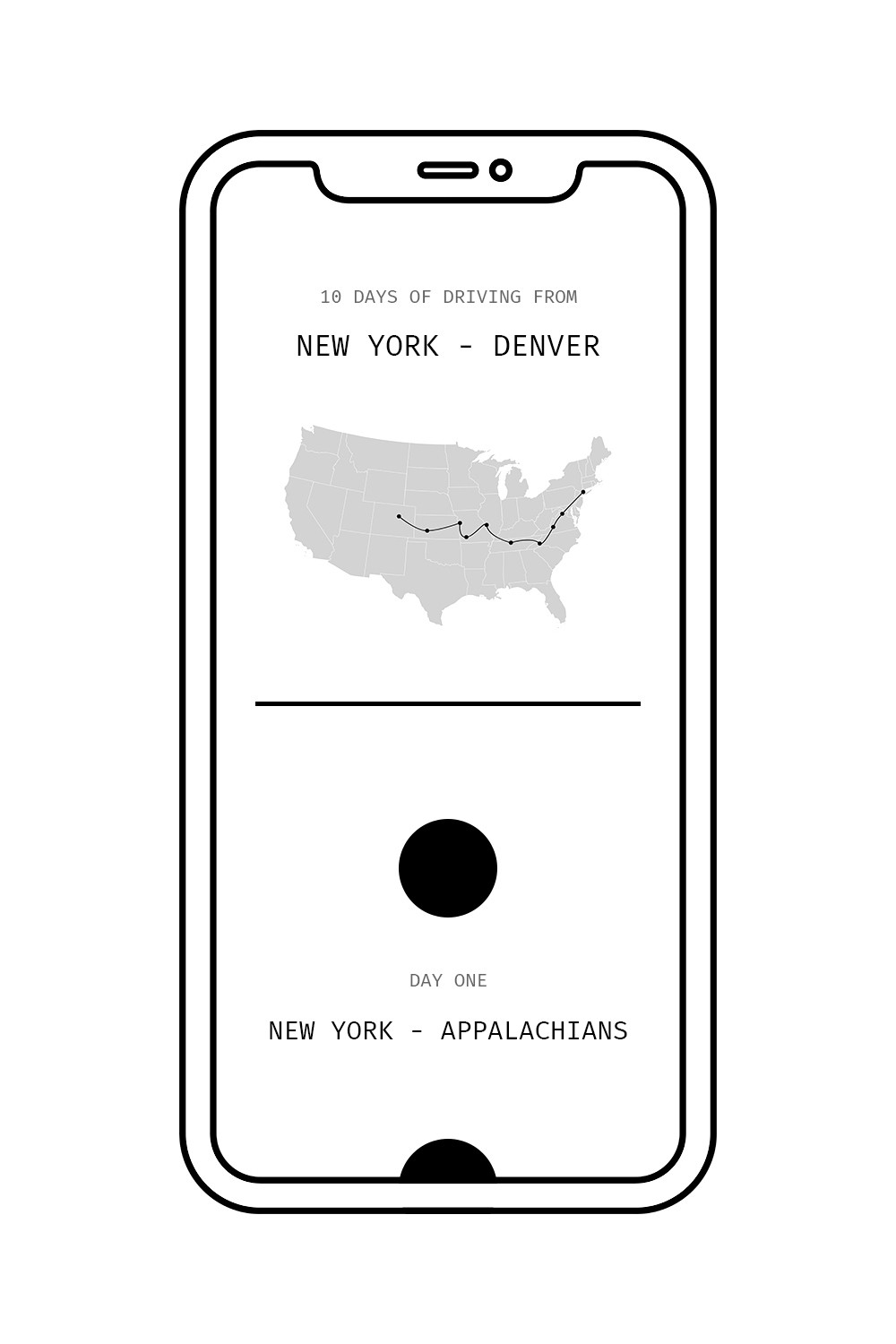
I followed up on the album with a simple, hand coded html + css web experience that let users click on points along my journey, revealing travel photos and the music tied to each location. It was an early foray into what would become an explosion of interest in storytelling through interactive design.
EXISTING TECH:
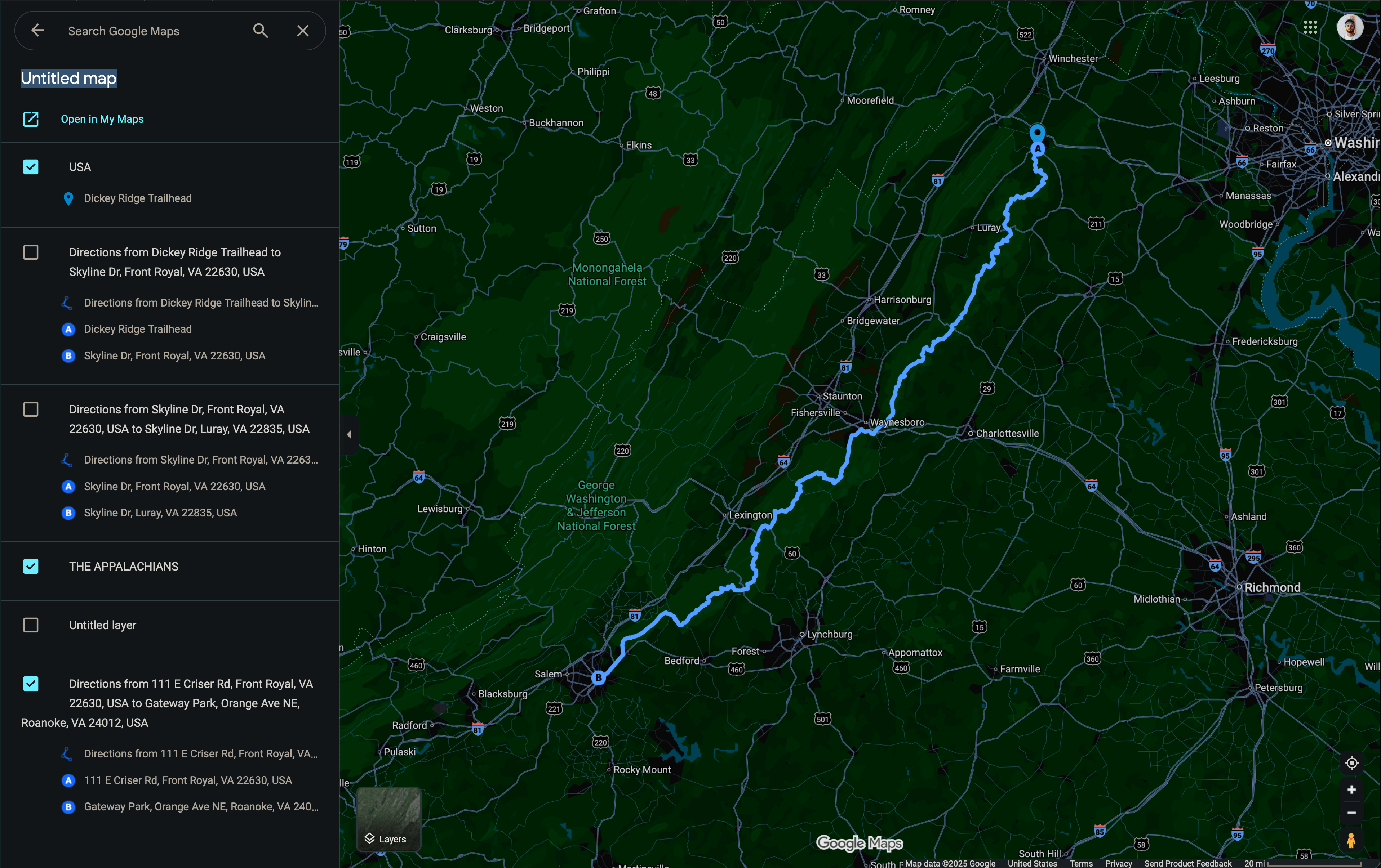
I tried to leverage Google Maps’ creative functions, but they were clunky and not designed for crafting a journey someone could follow. At the time, no other tool made it easy to share a pinned route with a clear beginning and end.
I GOT TO WORK
The entreprenuer in me saw the opportunity. Social Cartography. Subjective Mapping. There was a form of expression here that was untapped.
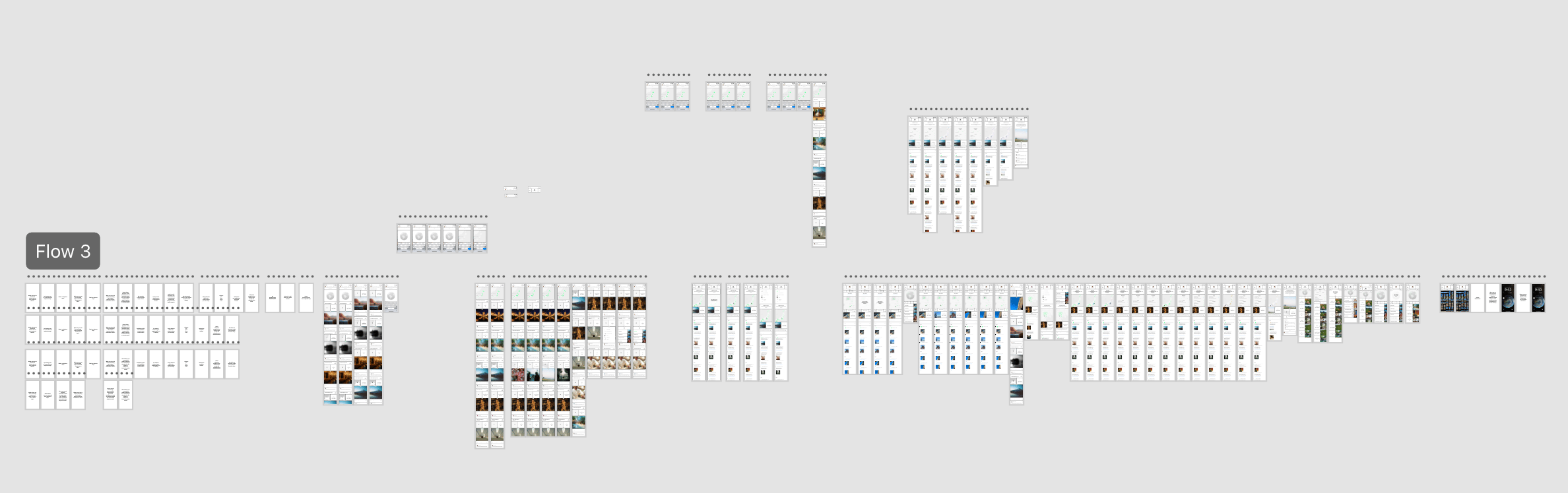
A unique design opportunity
Social Cartography would require intuitive design elements native to the premise and unprecedented in existing mapping applicaitons.
TIME IS A GRADIENT
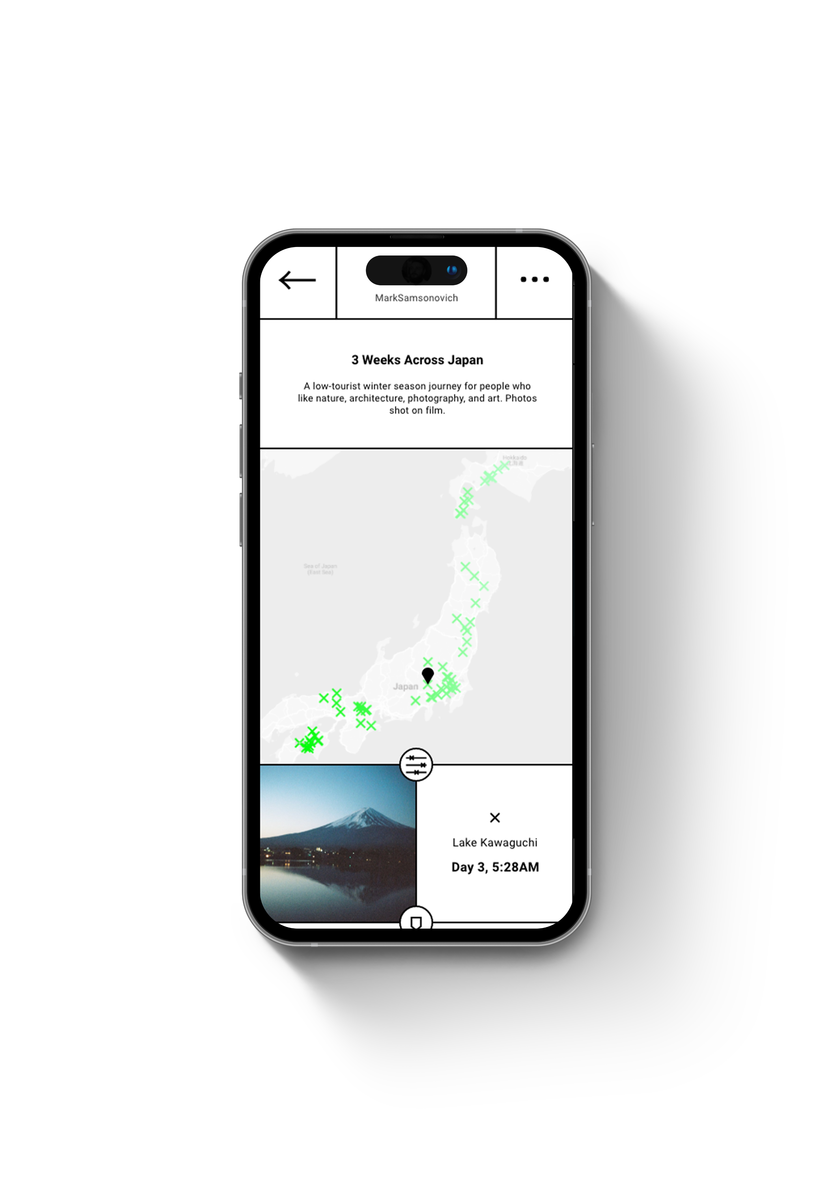
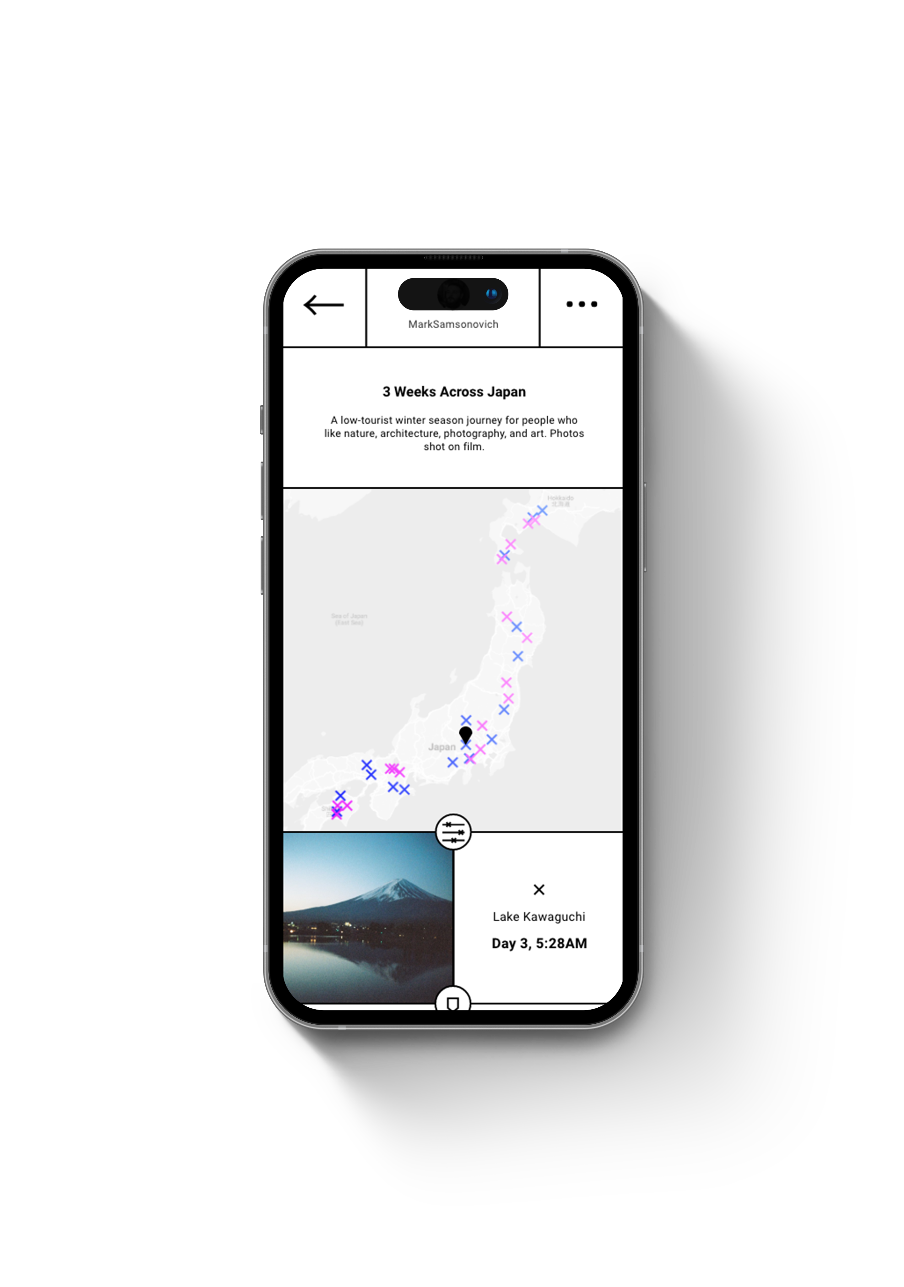
Pins on the map are colored as a gradient, representing time from beginning to end, or ranking from best to worst.
TATAMI- AN AESTHETIC CODE
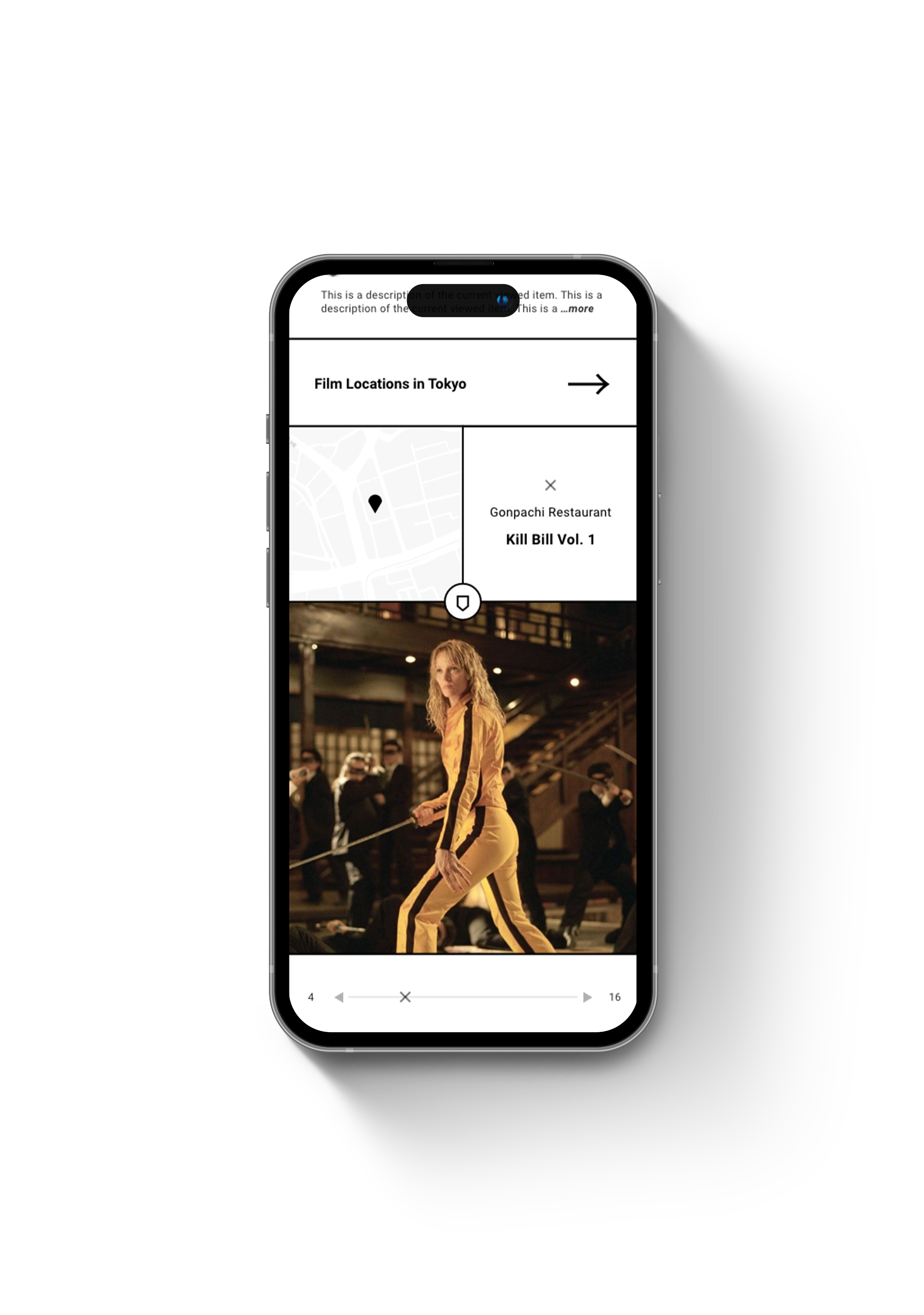
In traditional Japanese architecture, rooms are proportioned by the precise arrangement of tatami mats — modular units sized in harmony with the human form. Wondr echoes this logic, dividing its primary square into balanced rectangles and nested squares, creating a quiet visual rhythm that allows the 3-5 visible content areas to feel intuitive and deeply satisfying.
FUNCTIONAL COLOR
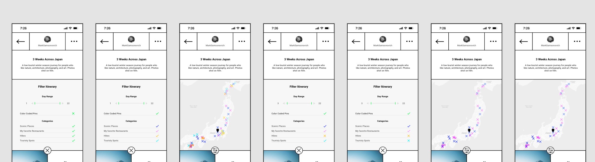
Working within a minimalist utilitarian aesthetic code, I saw color as an opportunity for some added fun as well as function. In this case, filtering pins by category.
Wondr maps the soul of a city.
F
i
n
d
T
H
E
X
o
r
f
o
r
g
e
i
t
Watch the demo
CONCLUSIONS & CRITIQUES
Wondr set out to make places feel personal, to turn maps into canvases for memory, story, and aesthetic experience. But when I first introduced the concept, the response from potential investors was tepid: they saw it as “just another scrollable feed.” In retrospect, I realize I had misframed Wondr’s purpose; I leaned too heavily into the social discovery angle, rather than presenting it as a creative tool for spatial expression.
REFLECTION
I’ve come to believe that the best tools don’t merely solve problems - they extend the human impulse to narrate, arrange, and express. What Wondr captured, even in its early form, was an intuition about how people long to map meaning onto place. As someone shaped by a lifetime of using creative tools, conceiving a new medium for expression was not only a privilege, but a pursuit I still believe is destined to find life in the world.